
Colour Management Explained: It's All About Toast
Making 'Colour Matching' Make Sense
Matching colours correctly is a process that happens behind the scenes. You might not realise how important it is, or why we take it so seriously. A number of years ago, I read an article that explains why colour management matters using a brilliant analogy. It's all about making toast.
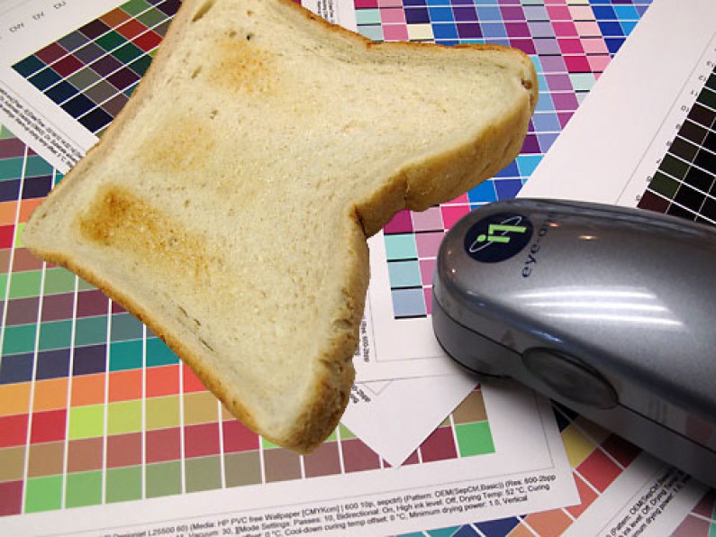
Here's my take on burning toast.
You throw a piece of bread into your toaster, Toaster 1, on setting 4. Eventually it pops up a shade of brown. You grab your bag of bread and head next door. You do the exact same thing on your neighbour's toaster, Toaster 2, and no surprise, the two pieces of toast look different. Assuming you want them to match, how do you get there? You've got two options.
Option 1: Toast a piece of bread on each setting from 1 to 10 on Toaster 2, then line them up as a chart. When you need to match a toast colour from Toaster 1 on Toaster 2, you visually compare the colour to your chart and turn the dial to whichever setting looks like the best match.
Option 2: Toast bread on each setting from 1 to 10 on Toaster 2, but this time measure each result with a special toast colour reading device and save the values into a software program, which now controls the toaster. The software analyses the values and adjusts the electricity flow so Toaster 2 can toast in even, predictable colour steps from 1 to 10. Keep letting the software toast and measure hundreds of pieces of bread to build up even more shades. Do the same thing on Toaster 1. Now the software knows every shade for both toasters. When you ask for a specific colour from Toaster 1, the software compares it to its measured library and tells Toaster 2 exactly which setting to use, or adjusts it automatically.
Which option actually works?
Option 1 sounds easy, but what happens when the heating elements wear out and Toaster 2 changes over time? The chart on the wall still shows the original colours, but the toast coming out now isn't the same. Would anyone even notice? Probably not. It's a cross your fingers and hope for the best approach. Not a good option.
Option 2 keeps everything contained in software. Even better, you can regularly re-toast levels 1 to 10 so the software recalibrates and those hundreds of original readings stay accurate. You can trust the software to correctly match toast shades, even once the toaster elements have started to wear.
Now picture Toaster 1 as your file's colour working space, and Toaster 2 as our printer's colour working space. That's colour management. It's a precise method of measurement, and without it, you're left with a manual, hit and miss situation. We take colour management seriously, and you benefit from it on every single print.
Putting this into print terms
You provide files with an ICC colour profile attached or embedded, your working colour space. We calibrate our printers and media to build a colour space, or ICC profile, covering every achievable colour on that device. Our software compares your file to our printer's capabilities and converts the CMYK formulation to match, the same applies to RGB files.
When a file is processed, a blue in your file made up of 50% Cyan might need to become 30% Cyan and 3% Magenta to produce the exact same colour on our printer. If we run the same job again a year later, because we recalibrate our printers regularly, any colour shift in the printer over that time is already accounted for, and the output stays correct. If we ignored colour management entirely and just printed your file's raw 50% Cyan setting, the colour would come out too dark, and wrong, every time. A year later, it might be wrong in a completely different way, as the printer's ink densities shift again.
Quality. Reliability. Consistency. Happy toasting.
FAQs
What is colour management in printing?
Colour management is the process of measuring and calibrating colour so that what appears in a file matches what comes out of the printer, consistently, every time, rather than relying on visual guesswork.
What is an ICC profile?
An ICC profile is a colour space created by measuring all the colours a specific device, such as a printer, can achieve. It allows software to accurately convert colours from a file's working colour space into colours the printer can reproduce correctly.
Why do printed colours sometimes look different over time?
Printer components such as ink densities can shift gradually over time. Without regular calibration and colour management, this can cause the same file to print slightly differently on different occasions. Regular recalibration accounts for this and keeps output consistent.
Custom Banners in Christchurch and Across NZ: Materials, Sizes and Choosing What's Right for Your Job
.jpeg)
Choosing a Signage Company in Christchurch: Questions to Ask Before You Commit