Text On The Vertical: Choosing The Right Orientation For Signage
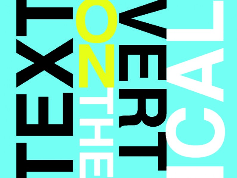
Which way should text go when running vertically for signage?
Downward, some would say, that's how many books do it; upward, others would say, that's how our eyes naturally track; stacked would also be suggested. Which one should you follow? Well you be the judge because in fact, its is really down to personal opinion and what pleases your eyes.
In most instances, text can be orientated horizontally, the easiest and fastest way to read. We don't always have that luxury in signage, where the available space leads to orientating text vertically. Banners and flags are a great example. As explained above, there are a fair few opinions about which direction content should be running, up or down. There is also the practice of stacking, but this only works well in very few situations, ideally with very few words.
Up Or Down?
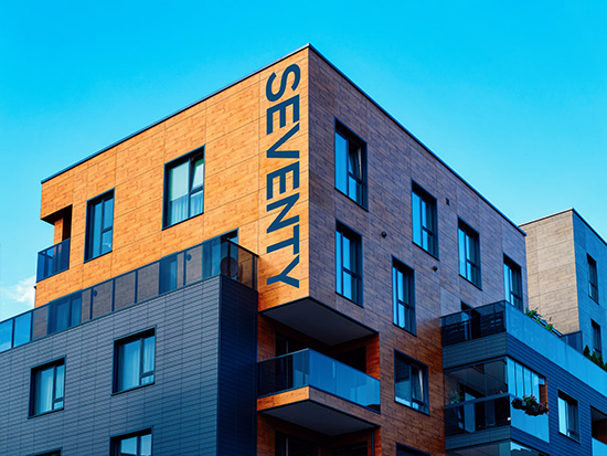
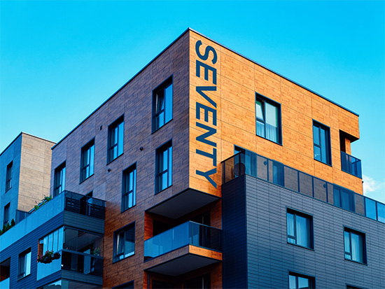
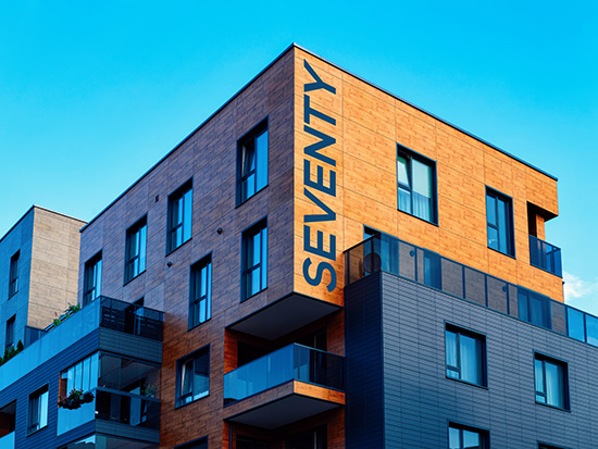
Check out this building. We have made two examples (well four actually). Text running up, text running down, and to make it a little interesting, flipped the building so there is a change of the apparent margin from right to left. What we found interesting (and unexpected), is that 'up' works on one, and 'down' on the other. We had a preconceived idea that one direction would look better than the other in both cases.

Standard theory of text running up for natural eye movement.
Text book fashion, running down hill. Which catches your eye the best?
Changing the 'page' margin, if you liked the book view before, how about now?
But wait, what are your thoughts on uphill reading now?
What About Flags, Banners And Stacked Text?
There's no better way to work out the best orientation than to look at it and judge it for yourself. Let's move on to flags, banners and stacked text.

This example shows the issues with stacked text. It's trial by error for each application, but as a general rule - the less the better. Short single words work very well. Font choice comes into play as capitals work best, and some typefaces, such as scripts, do not suit all caps. Lowercase letters need to be manually kerned, or the spacing will be all over the place due to ascenders and descenders. In the example above, the lowercase type was all manually spaced.
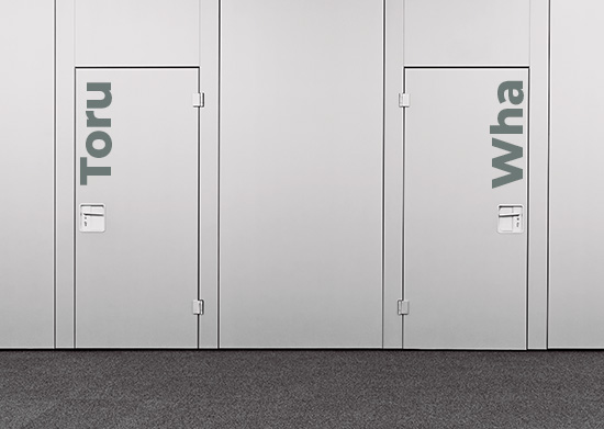
Heading into the office or arena environments. What is it going to be, up or down?
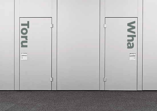
Does one look better than the other to you? Personally, its hard to choose between them from front on - maybe the upward orientation? But if walking along the corridor from the left hand direction then that might lead to the downward orientation working better?
Last up is a company logo. I am finding the downward orientation looks good on this one - so yeah the book spine theory works here. Again, a different logo might not work the same, so it pays not to have a fixed mindset when it comes to text on the vertical! Just go with the flow!
Still not sure what is best for your business? Give the team at Adgraphix a call to discuss your options today.
Election Signs With Less Waste

Signage For Construction Sites In NZ - What Works And Why
