When Colour Combos Fail
Ever seen a sign you had to squint at? Chances are the colours weren’t doing their job. Colour choice isn’t just about looking good - it’s about making sure your message gets across quickly and clearly.
The Problem with Poor Combos
Some colours simply don’t play well together. If there isn’t enough difference between the text and the background, your message fades away. If colours clash too much, the sign can feel hard on the eyes. Either way, the result is the same... people miss what you’re trying to say.
Common Offenders
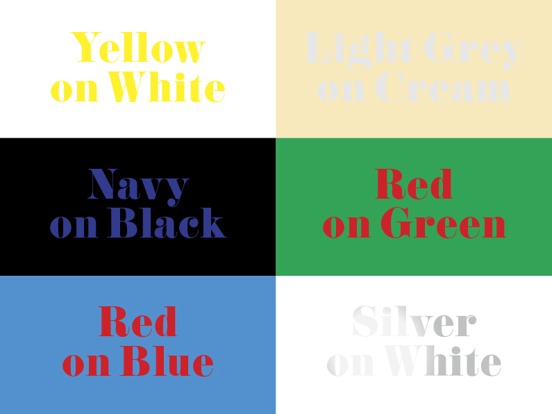
Here are a few combinations that often fail in print and vinyl signage:
- Yellow on white - disappears almost completely in daylight.
- Light grey on cream - too subtle to stand out.
- Navy on black - looks sharp on screen, gets lost in real light.
- Red on green - festive maybe, but tough on the eyes and near-invisible for colour-blind viewers.
- Red on blue - the colours clash and vibrate; often needs a white outline just to hold it together.
- Metallic silver on white - reflective in the wrong way, leaving a muddy or vanishing message.
What Works Better
The simplest rule is this: keep it clear. Light text on a dark background, or dark text on a light background, will always win. Pairing strong colour with a neutral tone also helps your message shine without distraction. And if you’re set on using tricky colour pairs, add an outline or shadow to separate them.
Final Thought
Signs need to be read in seconds, not studied. The right colour combination makes sure your message lands first time, every time.
If you want to do some further reading and see more in depth examples of many colour combinations, then check out this article by Designworkplan called Signs and colour contrast>>.

Election Signs With Less Waste

Signage For Construction Sites In NZ - What Works And Why
