When Text Height Matters

Size matters when it comes to signs. Too small and no one can read it, too big and the message gets lost in the noise. Good design is not always about looks - it's about serving a purpose. This guide breaks down how to choose the right text height so your words are clear, legible, and do their job at the right distance. Simple maths, quick reference, and maximum impact.
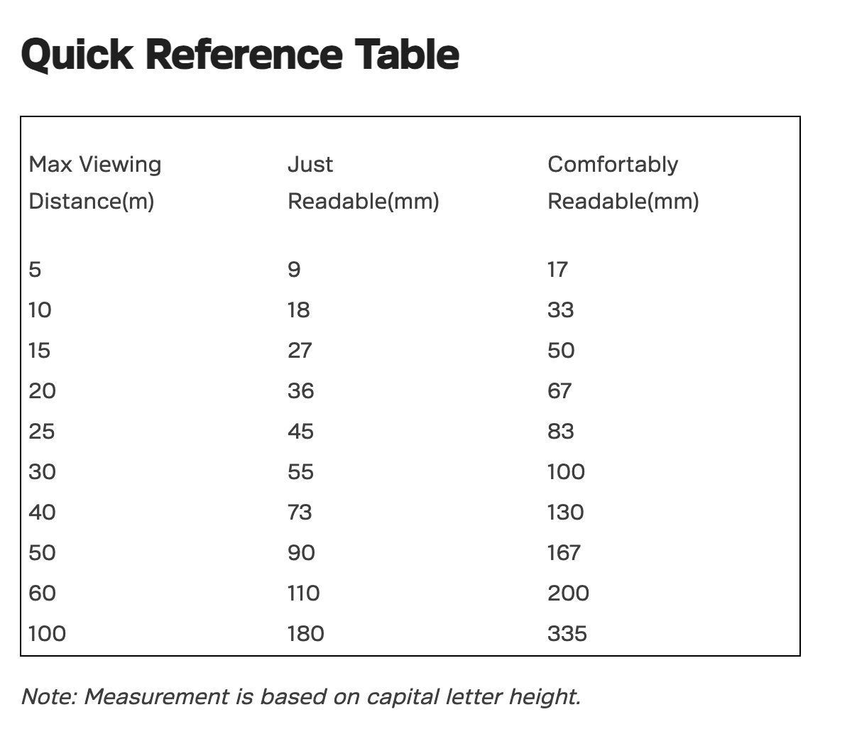
Text Height Readability Guide
The simple formula.
There’s an easy way to work out how large your text should be:
- Step 1: Work out how far away your sign needs to be read from (in metres).
- Step 2: Divide that distance by the factors below, depending on how important clear legibility is.
- Just readable: divide by 0.55
- Comfortably readable: divide by 0.3
Example: A sign viewed at 10m should have letters at least 18mm high to be just readable, or 33mm high to be comfortably readable.
Reverse Formula - Checking Designs
You can also multiply your text height by the same factor to calculate the distance at which it will be readable.
Example: 65mm text × 0.55 = 36m (at 36m it will be just readable by most people).
Verifying an Existing Design
If you already have a layout, this guide can help confirm whether your chosen text size will work from the intended viewing distance.
Remember: bigger is always easier to read - and better for making an impact.

Election Signs With Less Waste

Signage For Construction Sites In NZ - What Works And Why
