Colour Part 3 Workspaces And Conversions

How To Stop Your Masterpiece From Turning Into A Muddied Rainbow At Print Time!
It’s time to look at your design software and how to best prepare files for predictable printing. As discussed in previous articles, the most important thing you can do is assign colour profiles to your work and keep them consistent. If you have multiple linked or placed files in a design, ideally they’re all converted and embedded with the same profile (e.g. US Coated SWOP v2), especially so if they have corporate colours in them.
It’s not uncommon for graphic designers to be unaware they’re compromising their colour consistency. We get it: in the pursuit of a stunning design, how you generate colours isn’t always front of mind. We sometimes receive jobs where one file is RGB and another is CMYK - variations of the same artwork. You simply won’t get consistent output in that scenario.
1. Pick A House Style And Stick To It
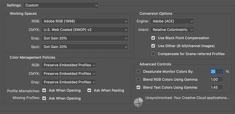
Decide on your working spaces up-front and make every file play by the same rules. Example.
- CMYK: US Coated SWOP v2
- RGB: Adobe RGB (1998)
Sync Illustrator, Photoshop and InDesign in Bridge so they all read from the same hymn sheet if you choose.

2. Turn On The “Are You Sure?” Warnings
In Edit › Colour Settings tick:
- Ask When Opening
- Ask When Pasting
When Adobe spots a stray profile it will prompt you to:
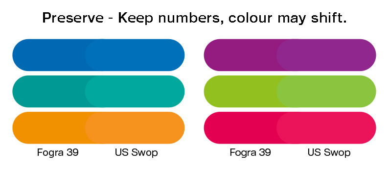
- Convert – keep the look, change the numbers
- Preserve – keep the numbers, colours may shift
Nine times out of ten, Convert is the safer choice.

3. Assign vs Convert – The Two-Second Gut Check
- Assign Profile
- Appearance shifts, numbers stay the same
- Use when tagging an un-profiled legacy file
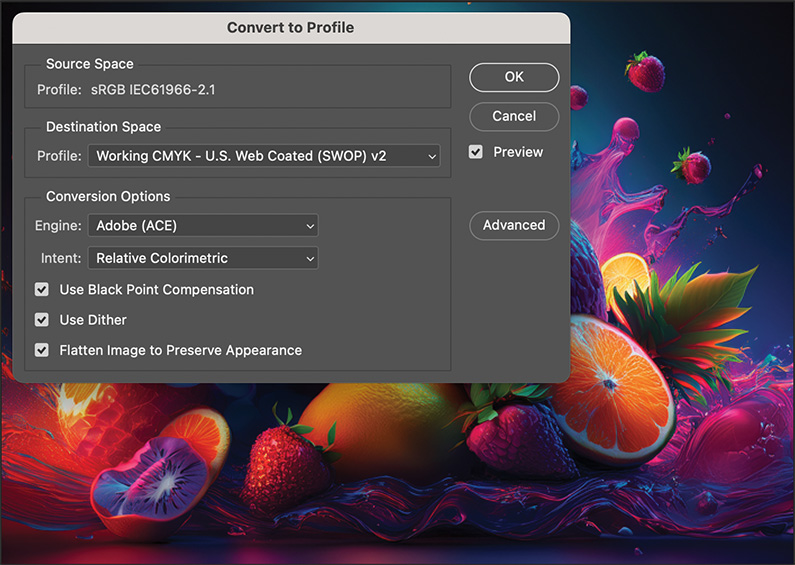
- Convert To Profile
- Numbers change, appearance stays the same
- Use when prepping for final print or PDF export
Avoid multiple conversions (RGB → CMYK → CMYK) or you’ll nibble away at vibrancy.

4. Linked Images Need The Same Passport
Keep placed TIFFs/JPEGs in the same ICC profile as your Illustrator document, or at least embed their profile. Logos and vector art? Make them CMYK from the outset so they land correctly on press.
5. Always Embed Profiles
That little tickbox when you save is your safety net. No profile = software has to guess what those numbers mean. And guesses can cost time (and money).
In A Nutshell...
- Choose a working space.
- Sync your apps and turn on the warnings.
- Convert (don’t just assign) for consistency.
- Avoid serial profile hopping.
- Embed every time you save.
We highly recommend you grab a few images and play around in Photoshop, or just splash some colours on an artboard and change the colour profile. Compare how convert versus preserve works on it. There are a ton of resources about handling colour and converting all over the web.


