Pantone Without Pantone?
There is a lot of commotion in the graphic design world regarding how Pantone fits into the colour specification picture, now that they have parted existing ways with Adobe. Regardless of which side of the fence you stand on, we can clarify how it affects the work we do for you, and more importantly, how we handle Pantone colours, whether you use the new Pantone Connect swatches or not.
Pantone matching has its pro's and cons when used for signage and digital printing, and there are a few misconceptions around sharing colour information as seen in the bulk of corporate brand manuals. The greatest strength of Pantone is the ability of any designer or service provider to look at physical swatch books, anywhere in the world and see the same colour (well pretty close to the same). How the matching is done is another story.
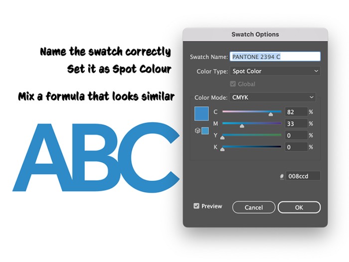
The best way to specify your desired Pantone colours is by using Pantone Connect digital swatches in your file. Of course this is not possible for all, as some have chosen not to pay extra for the digital Pantone libraries. We get that - you have your physical swatch books, you can see the colour. So why do you need to pay more just to include that colour into a print file. The short answer is: well, you don't necessarily need to. As long as you create and name a spot (Pantone) swatch colour in your file correctly, we can work with it just the same. How does this work?
We utilise Onyx Thrive RIP software, which includes many up to date Pantone coated and uncoated libraries. So, if we happen to throw a file at it with named spot colours, the software will recognise them and make a 'best match' calculation to formulate ink densities that closely simulate the colour. All it takes is you creating a spot colour swatch and giving it the appropriate name such as Pantone 2394C. To avoid it looking weird on screen, you can adjust the CMYK sliders to make a rough visual representation of 2394 - bear in mind this has no effect on production. But it's not actually this simple.
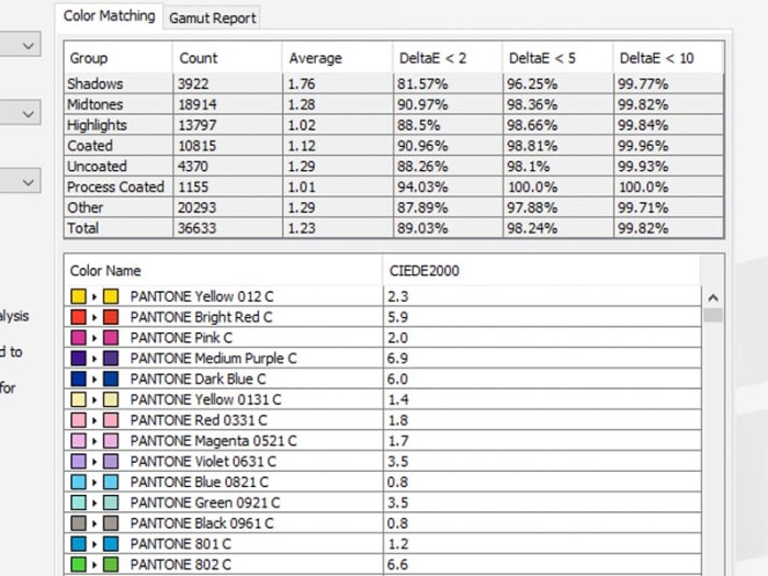
In the world of digital print and signage, we can't match all Pantone colours. After all, they are actual printing inks. Different coloured signage vinyls have their own ranges, and only a few truly match Pantone colours. Moreover, with digital printing, we can only achieve about 90% accurately. Now let's take the word accurately, that is quite subjective. Differences between colours is a measure called Delta E, and anything that is a Delta E 5 or less is generally considered an acceptable match and Delta E of 2 or less is accurate (zero being an exact match). That is all good in theory, but in our experience the human eye along with the level of anal retentiveness of its wearer tells a different story.
Pretty good 'automatic' software generated CMYK simulations (Centre).
In our experience (Delta E aside), the 'best match' from the software ranges from excellent to not so much. Interestingly, often we can fine tune these to a match that we humans feel is even more similar to the intended colour (more pleasing than the computer match). Of course to go through the process doing a hand crafted match to the physical book is going to cost more than an auto generated (software) match. But for the fussier of us, it's the best way to go. Even with the best attempt at a hand crafted match, sometimes it's still not good enough. In these situations we have max'd out and hit the limitations of mixing CMYK inks, we have also hit a weakness of the Pantone system too.
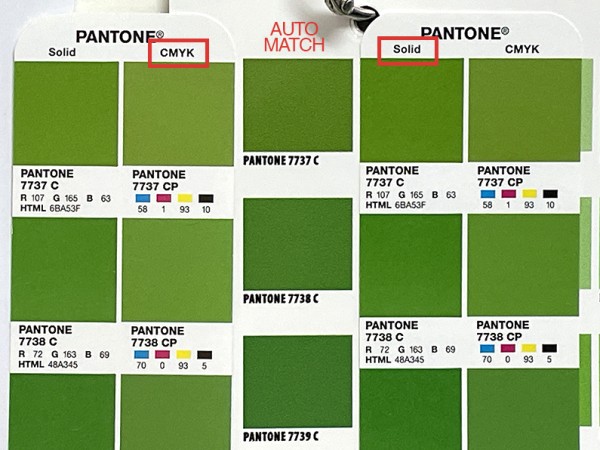
An example of a Pantone ink that we cannot match. Note the Bridge CP alternative is very different to the ink swatch.
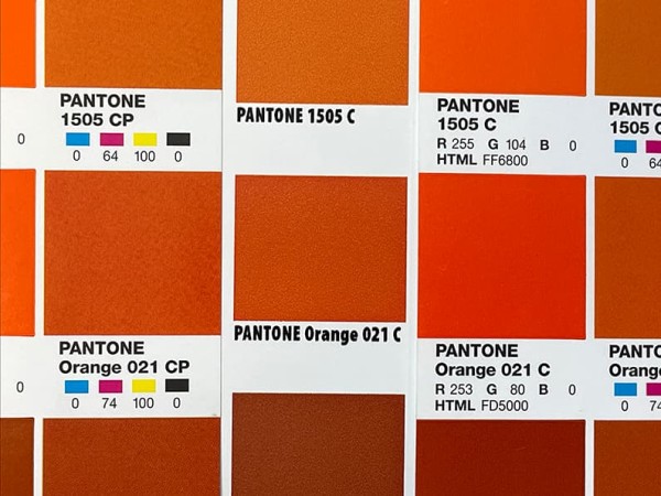
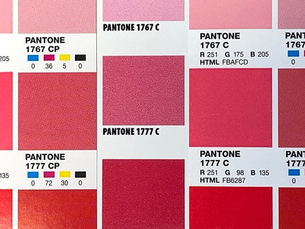
Pantone inks are straightforward, what you see on the physical swatch is what you get. CMYK formulations on the other hand are a tad more difficult. They are device dependant, meaning, they don't necessarily refer to any colour until they are assigned to a colour space. Fortunately most CMYK colour spaces in Adobe products are not extremely different from one to another, so it is less likely you will get in a situation like with Pantone, where the best match is miles off. Because of this, specifying CMYK is a really good way to go for corporate colours. Ideally you let your print provider know what colour space you have used for your design, so it can be best matched. But what about Pantone CMYK?
Many corporate brand guides specify hex numbers, CMYK formulations and RGB values as alternatives with the Pantone swatch number. This is not recommended for digital printing. Those values are all device dependant formulations, and without a colour space being specified (and Pantone don't specify one for their process colours), they don't really represent the PMS ink colour necessarily. If you convert a Pantone swatch to CMYK in your file, the actual values will differ depending on the colour space you are working in - and will be confined to that.
Now to the lighting side of things. In addition to all of the above, we have another factor that influences how the colour is seen. Lights and the sun. Wander about the office with a swatch of colour and you'll find it takes on a different appearance depending on where you are standing. Flouro tubes, LEDs and incandescent bulbs all emit different coloured light. From cool blue to warm yellow, they have an impact. Even taking your swatch outside has an impact. A sunny afternoon has different light to an evening sunset as does a morning sunrise to a cloudy day.
Before heading back to summarise our Pantone colour matching process, let's cover expectations. If you are of the nature to expect perfect matching every time, it would be a good move for your to lower your standards a tad. Whichever way you choose to go, Pantone or CMYK, you need to understand that even with the best systems in place, you will not achieve that holy grail. Different machines, different stocks and shifting states of consumables all play a part in what a colour will look like. Some we can influence and others we are at the mercy of. For the sake of your sanity it is very important to accept a close match as a good match. As much as we do aim for perfection here, shifts can occur and are considered within tolerance.
Expectations part 2. Pantone specific. If you have a desire to hit either a match for the Pantone ink colour, or a match to the bridge colour, then specify that is your desire with your order. The thing is, while trying to match the actual Pantone ink swatch, it's quite possible we don't hit it but land in an area between the Bridge swatch and the Pantone swatch, ie a closer match than Bridge. And also keep in mind that on some occasions the media / printer combination cannot hit the bridge colour either. And also keep in mind the difference between the Bridge colour and the actual PMS swatch can be quite large, but is acceptable, as should be the close matches using our system.
Would you accept this auto simulation? What is your tolerance?
In summary:
Accept that it is perfectly okay for your printed corporate colours to shift a bit, just as it is acceptable that colours appear a little different on digital screens and displays.
Pantone Colours
• If you have Pantone Connect, feel free to continue to colour your files with Pantone swatches.
• If you have a Pantone swatch book, but have chosen not to use the digital swatches, manually make your swatches, ensuring they're named exactly as Pantone does. We will take care of the rest.
• Don't expect the default CMYK formulation for a given Pantone colour to print just like the Pantone ink swatch. If you intend to print the PMS colour, then make sure you keep it as a Pantone swatch. If you do use those CMYK formulations in your design with no mention of a PMS number then be aware that we are matching a CMYK colour (not a Pantone) and any other print vendor who receives them will do the same.
• Around 10% of Pantone colours we simply cannot match using CMYK printing.
CMYK Colours (Not Pantone)
• Using CMYK formulations can give you predictable consistent colour.
• Choosing colours on-screen using CMYK is perfectly acceptable for colour specification. You must specify the colour space you were working in though for the best results.
Final word: It is possible to create files using Pantone (books) without Pantone (digital swatches).
