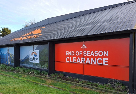
Sign Placement, The Right Height, Angle, And Lighting For Maximum Impact

In the competitive signage landscape within physical retail, real estate, and event marketing, a sign is far more than just a printed object. It is a strategic investment designed to capture fleeting attention and prompt action. You can spend thousands on a perfect sign design, size and graphics, but if the sign placement is poor, your investment isn’t out there working its hardest for you.
The science behind effective signage placement is all about targeting human visual perception and environmental physics, creating the optimal viewing experience for your target audience. In this post, we will look at the three scientific pillars of high-impact signage strategy - Height, Angle, and Lighting.
The 3 Pillars Of Signage Placement
Optimal sign placement is the strategic combination of these three pillars:
- Height: Placing the sign in the primary cone of vision for the target audience.
- Angle: Using perpendicular angles to maximise distant visibility while mitigating glare and sun exposure.
- Lighting: Selecting the right illumination type and colour temperature to extend visibility 24/7 and align with the brand’s psychological message.
1. How High Should My Signage Be?
The golden rule of sign placement is to position your message directly within the average human line of sight… but this tends to vary drastically depending on the viewer's speed and mode of transport and the location of the signage. Therefore, we must look at vehicular traffic versus pedestrian.
Driver Signage
For vehicular traffic signage (Billboards, Building Signage, Hoardings), drivers are moving fast, and their focus is generally straight ahead, and their immediate cone of vision tends to be very narrow, expanding only slightly to catch peripheral information. Therefore, signage aimed at drivers must be:
- Elevated For Clearance: The sign needs to be high enough to clear surrounding obstacles (trees, traffic lights, power lines) without being so high that the driver has to strain their neck to look up.
- Away From The Curb: The message should be readable before the driver enters the final decision zone, giving them time to process the information safely. The ideal height often means the bottom of the sign is 6–10 metres above the road to be seen clearly over cars and buses.
Pedestrian Signage
For pedestrian traffic (Shop signage, Lightboxes, Window Decals) the movement is slower, with a much wider line of sight. Plus, they have the added dwell time factor (the time spent pausing to read the signage).
- The Optimal Height Zone: This is typically between 1.5 to 2.5 metres off the ground. This area is comfortable to read without tilting the head and naturally intersects with the eye line of someone looking forward.
- Avoid Ground And Sky: While floor graphics are great for novelty or wayfinding, similarly placing key information too high forces the pedestrian to look up, or worse, they miss it altogether - primary messaging should always be readable at eye level.
2. Why Does The Angle Matter?
The angle of your sign dictates when and how easily a customer can read it, affecting both early identification and retention. There are two main options here:
Parallel Signs: These run flat against the building facade and are perfect for pedestrians who have already turned the corner or are directly approaching the store. They maximise the use of available space and tie the sign directly to the architecture. However, they sometimes offer poor visibility from down the street, especially in crowded urban environments where buildings are close together.
Perpendicular Signs: These jut out perpendicularly from a building or stand alone (plinth/monument signs) and are far superior for visibility along a busy thoroughfare. These signs offer visibility to both vehicular and pedestrian traffic from a much greater distance as they approach. For optimal performance, sometimes a slight angle (30 to 45 degrees relative to the street) can optimise the viewing geometry for drivers coming from the dominant direction, ensuring they catch the message without turning their head too much.
What About Reflection And Glare?
Working with angled signage can also be useful in mitigating or amplifying uncontrollable environmental factors like glare from sunlight and even streetlights. If your sign has a glossy laminate, is made of highly reflective material like polished acrylic, or features digital screens, careful angling is not just desirable, it's necessary. Positioning a sign so it directly catches the sun will effectively blind the viewer and render the message unreadable for a significant number of hours throughout the day.
3. Understanding The Psychology Of Lighting
Lighting is the element that determines your sign’s return on investment by extending its visibility from 12 hours a day to 24 hours. The choice of illumination also affects perception, readability, and brand image.
- Maximising After-Hours Visibility: This involves lighting the sign from the back, projecting a glow (or "halo") onto the mounting surface for contrast. Offers a high-end, sophisticated, and contemporary look. It is often used for corporate offices, premium retail, or architectural branding where subtle elegance is desired over blunt brightness.
- Front-Lit: This is the most common and often the brightest method, where illumination is placed directly inside or in front of the sign face. It maximises brightness and colour saturation, which is essential for large format billboards and retail signs, where the goal is maximum, immediate attention. This type of signage can be internally lit or externally lit (using ground-mounted fixtures).
- Digital LED Screens: While highly dynamic, digital screens require careful calibration based on ambient light. During bright daylight, the screen needs high brightness to compete with the sun, in contrast, the same brightness at night is often too much, reducing readability and potentially violating local council regulations. High-quality digital signage systems often use ambient light sensors to automatically adjust brightness levels, ensuring the sign is visible but not distracting or glaring.
What Colour Means To Your Customers
You might be surprised to learn that the colour temperature of the light source (measured in Kelvins) can affect the mood and perception of your brand.
- Warm White (2700K - 3000K): Tends to convey a more cosy, welcoming, or traditional feeling (often used in hospitality or cafes).
- Cool White (4000K - 5000K): Presents a clean, modern, efficient, and bright appearance (favoured by tech companies, professional services, or for maximising visual acuity in medical or industrial settings).
Selecting the right Kelvin temperature should be as deliberate as choosing your brand colours, as it subconsciously impacts the viewer’s emotional response to your business.
By approaching your signage as a strategic science project rather than a simple aesthetic choice, you ensure that every printed visual is doing the heavy lifting with brand awareness and conversion, maximising the return on your entire signage marketing investment. Looking for large-format digital printing, complex signage, and display solutions for corporate, retail, and construction sectors across New Zealand? Talk to the team at Adgraphix today!


